Showing posts with label My Quilts. Show all posts

20 March 2023

Patio pattern baby quilt

Next step - binding.

A new baby will arrive soon, so of course I made a quilt. Not for use in the crib until baby can safely roll over, but useful as a clean surface for "tummy time," a layer in the stroller, etc.

The pattern is one of my favorites, Patio, designed by Happy Zombie

Reminds me of the graphics of Alexander Girard.

I used fabric from my extensive stash and only had to buy the backing fabric. Many of the fabrics are vintage prints (pre-1960 or so) - we can date these fabrics as they are 36" wide, not the current standard of 45."  Most of the prints are "conversational" - this is the textile world's term for fabrics with figurative images.  One of my favorites is a variation on Little Red Riding Hood (above.)

Attenuated people.


Ships in a bottle.

 
A fun music-themed fabric.
 
Mid-century modern colors.

Save those shards of china.

The fabric below was produced by Rose and Hubble and is based on mosaics by Kaffe Fassett.  It's a useful print because of all the colors; I employed it as the binding for this quilt.
 
Based on a mosaic installation for the Chelsea Flower Show.

 The backing is a cute owl fabric by Robert Kaufman designer Ann Kelle.  Machine quilted for durability - just an edge-to-edge pattern called Meander, expertly done by Burlington Electric Quilters.

Who-whoo!

18 January 2018


Flow Green, 32" x 42".

The last few years DH and I have been busy with some lifecycle events - moving to a smaller house, the arrival of grandchildren, etc.  - so there has been little time for quilting. However, I did manage to finish the quilt in this post last year.  The quilt showcases fabrics I painted in a workshop I took with Mickey Lawler, a fabulous teacher, ten years ago. 

At the end of the workshop I had a small stack of 18" x 24" hand-painted samples, and no clue as to what to do with them,  so they joined other workshop products in my stash. Eventually, some sketching led to the idea of floating squares, picking up the green and blue tones.

In progress, with wider blue strips.

When I first designed the layout, I made the blue strips 1" wide finished dimension. However, when displayed on my design wall, the blue strips clearly overwhelmed the painted blocks.  So, I recut and restitched the blocks with 1/2" finished dimension blue strips. Much better.

Relationship between painted square and blue "shadow" strips not pleasing.

Stencil and marking pen.

The quilt is hand-quilted using a stencil titled Water Background, from The Stencil Company, and Gutermann quilting thread in color 9837, which perfectly matched the sashing fabric, Kona cotton #253 Sprout.  I marked the entire quilt top before basting the quilt/batting/backing sandwich, using a blue ink water soluble marker made by Clover. The marker came with warnings: test on fabric first, and a time window on solubility of two weeks. So, I had two weeks to quilt this small quilt, and planned accordingly.  I met the deadline, immersed the quilt in my bathtub and the markings did indeed wash out completely.

Tools of the trade.

Final design: squares are 3.5", blue strips are .5" and green sashing is 2" wide.

28 April 2015

Shades of Gray baby quilt

Design is Patio, by Monica Solorio-Snow.

No, these shades of gray have nothing to do with block-buster escapist literature. The baby quilt in the image above, held by DH in bright sunlight, showcases a type of fabric your correspondent loves: prints in shades of gray, or gray with one additional hue, such as pink or yellow.  I have a number of these old fabrics from the days when apparel fabrics came in a 36" width, and the imminent arrival of a baby girl gave me an excuse to feature them in a quilt.

Vintage fabrics in grays with yellow.

The fabric on the left in the image above was a sturdy old apron, carefully picked apart, and upcycled for this quilt - click on the image to enlarge it and check out the covered wagon and log cabin.  Shades of "Little House on the Prairie." 

Prints with representational imagery are properly called "conversational prints"; sometimes ebay sellers refer to these fabrics as "novelty prints" but the phrase "novelty print" is more properly applied to fabrics with flocking, metallic components, or some other exotic (novel) feature.

The name of the quilt pattern is Patio, design by Monica Solorio-Snow, of Happy Zombie quilts, and it's a simple-to-make design. (I have no connection to Ms. Solorio-Snow; just found the pattern while browsing Pinterest for modern quilts.)  I widened the borders, from 1" to 4", to make my quilt, at 38" x 47", a bit bigger than the finished dimensions given in the pattern.

Vintage pink and gray prints.

Initially I mixed in some shot cotton solids with the prints, as you can see below in this tentative layout on my felt design wall, but the solids elements were too singular - they called too much attention to themselves - so back to look for more prints. (I think the pattern would work very well in all solids; it was just the mix that didn't work.)

Early layout.


I didn't have enough gray-with-color prints - this pattern really requires at least twelve different fabrics - so added more from my stash and luckily found the silhouette fabric on the right, below, on ebay.  (Talk about serendipity.) Again, enlarge to see the fairy tale imagery in the print on the left.

Gray and black-and-white fabrics.

For the backing fabric I used another old fabric originally from retailer J. C. Penney. In the post-war era, Penney's sold lightweight cottons with "A Regulated Cotton Never Misbehaves" printed on the selvedge.  The individual fabrics in this line each had a title, as well - this one is "Banjo." The middle fabric in the image above, also from Penney's line, is "Florentine."  The "Never Misbehaves" part referred to the fabric - meaning that the goods wouldn't bleed or shrink excessively.  (I think the women wearing clothes sewn from the fabric could behave in any way they wished.) The "hand" of these fabrics is just wonderful.


For sashing I used Kona cotton in "Ash."  The quilt top was machine-quilted by Martha Garvey, who chose the pantograph quilting pattern "Cotton Candy," and a thread color called "Pearl."  Pattern and quilting thread were prefect for this little quilt, now finished, delivered, and  ready for baby "tummy time."

All pieced, waiting to be quilted.

26 March 2015

Kyoto Flea Market quilt

Kyoto Flea Market quilt, on display.

Just finished two quilts, one of which is shown above, in DH's home office. The pattern was inspired by Kathy Adams pattern Japanese Story.

Kathy Adams, Japanese Story.

The geometry is fairly basic, so I didn't purchase the pattern, but worked out the dimensions and construction on my own. However, the pattern gives yardage requirements, cutting instructions and assembly diagrams, so would be useful for someone just beginning in quilting.

Rolls of narrow width woven fabric.

I named the quilt Kyoto Flea Market as I purchased the patterned fabrics at a temple market in Kyoto in 2012. To my dismay, when I returned home I found most of the fabrics had holes and other areas of damage (the fabrics were tied in tight, unscrutinizable bundles at the market). However, there was enough usable material for two nearly identical quilts (a limited edition, if you will). Buyer beware, indeed!

Items at the temple flea market.

This pattern is a useful way to "corral" a collection of large-, medium- and small- scale fabrics and show them to advantage.  Below is a "blankie" for a child assembled from shibori samples made in an Elin Noble workshop.

Shibori sampler quilt.

Detail, Kyoto Flea Market quilt.


The sashing is black Kona cotton, and while most of the hand-quilting is done with black thread, I hand-quilted the sashing using red thread - subtle, but a little zingy.

03 March 2015

Cat Gallery quilt

Note the screen saver - we like cats of all types.

Just finished a quilt begun in 2013....talk about the Slow Fiber movement... but now the work has a binding, hanging sleeve, and a good place in DH's home office. We are a family of ailurophiles.

The impetus for this quilt was an old fabric, featuring stylized cat face designs in red and gray, found on ebay.  This fabric can be seen in the large blocks bordered in black in the quilt.  Also used is a recent Michael Miller fabric based on the designs of 1950's artist Tammis Keefe.  I had enough of the old fabric to make three of these quilts, sort of a limited edition; the other two quilts were given to veterinarians.

Quilt on display at animal hospital.

Vintage cat fabric, before quilting.

Red, white and black is a timeless quilt color scheme. The quilt was fun to work on, although I went a bit overboard with the hand-quilting.

Detail showing pieced border.

28 July 2014

Marble Collection quilt


Marble Collection.

After four years, I finally utilized the 9" squares of marbled fabric made in a fabulous workshop with Elin Noble. The marbleizing techniques with which we are familiar today evolved in the Middle East beginning in the 15th century, as a way of decorating paper to be used as a substrate for calligraphy.  The craft move westward as the techniques were adapted to produce decorative paper sheets utilized by European craftsmen in the book-binding arts. 

9" marbled fabric squares.

My marble fabric workshop samples languished in my fabric collection until I admired the "Thousand Pyramids" quilt below, with its bright accents of yellow, from the Quilts and Color exhibit at the Boston Museum of Fine Arts.

Somehow, in my mind's eye, the book arts tradition of marbling collided with a venerable American quilt pattern, and I set to cutting up my marbleized fabric squares into equilateral triangles. I indulged my love of yellow, generally the stepchild of today's quilting world.

Thousand Pyramids quilt, ca. 1920, maker unknown.

Lengthwise grain marked lightly in pencil.

After auditioning every yellow solid in my stash I marked 4 1/2" strips, then subdivided these into equilateral triangles. (I use both rotary cutting techniques and scissors in my work.) To ensure the triangles were eventually sewn with the lengthwise grain running in consistent alignment, I marked the grain lightly on the back.

Since the appearance of fabric is dependent of how light strikes the woven surface, stitching the yellow triangles in just any old alignment would have resulted in the solid yellow material looking variable and uneven in tone, distracting from the beautiful randomness of the marbled fabrics. This quilt is all about contrast - the stability and regularity of geometric triangles as a foil to the animated chaos of the marbled colors.

My large gray felt wall helps me organize the layout, and sticky notes record the position of each piece.

Final layout of triangles.

Sewn rows of triangles.

I love the look of carefully sewn quilt backs.

All basted, with a solid yellow as the backing.

I basted on the floor, as usual, as the lines of the oak strip flooring help align everything.  A solid yellow backing will reinforce the golden glow of the yellow triangles in the top.

In the hoop.

Using 1/4" quilting tape as a guide for outline quilting.

Narrow border of random triangles.

A shot cotton binding vibrating in pink and periwinkle sets off the yellow but works with the colors of the triangles. This quilt is not an earth-shaking or innovative visual symphony - it's more of an etude, perhaps - but it has some impact, and I am pleased to get those marbled fabrics out into the world, at last.


28 November 2012

Cats in Japanese prints and more

Kitagawa Utamoro I. Yorimasa.
Last weekend, stuffed with turkey and trimmings, DH and daughter and I headed to the Boston Museum of Fine Arts. After taking in the Postcard Age show (see previous post) we headed to the Asian galleries to view Cats to Crickets: Pets in Japan's Floating World, a small but enchanting exhibit on display through February 18, 2013. The curator selected 18th and 19th-century woodblock prints featuring pets of all kinds, including monkeys, dogs and goldfish, but this cat-lover only had eyes for the felines.  Unless noted, all of the Japanese images are from the exhibit.

Most of these prints illustrate familiar stories or everyday scenes of light-hearted activities and pastimes. For example, in the first print above, a girl watches, hiding her smile, as two boys act out a scene from a popular play, Yorimasa, in which the brave warrior Yorimasa and his retainer slay a monster plaguing the Emperor. In the enactment above, a pet Japanese bobtail cat performs as the monster.

Utagawa Sadakage. Detail, Pride of Edo: An Assortment of Beauties.
The cat in the image above, two panels of a tryptich, is a calico cat - a lucky cat of three colors, orange, black and white. Kitty is indeed lucky, curled up on a blanket over a kotatsu, a cozy Japanese arrangement in which a heat source is placed under a table which is then covered with a quilt or blanket. Everyone sits with their legs under the quilt; the cat has the prime spot right on top.

Modern kotatsu setup. Photo credit: www.johnharveyphoto.com
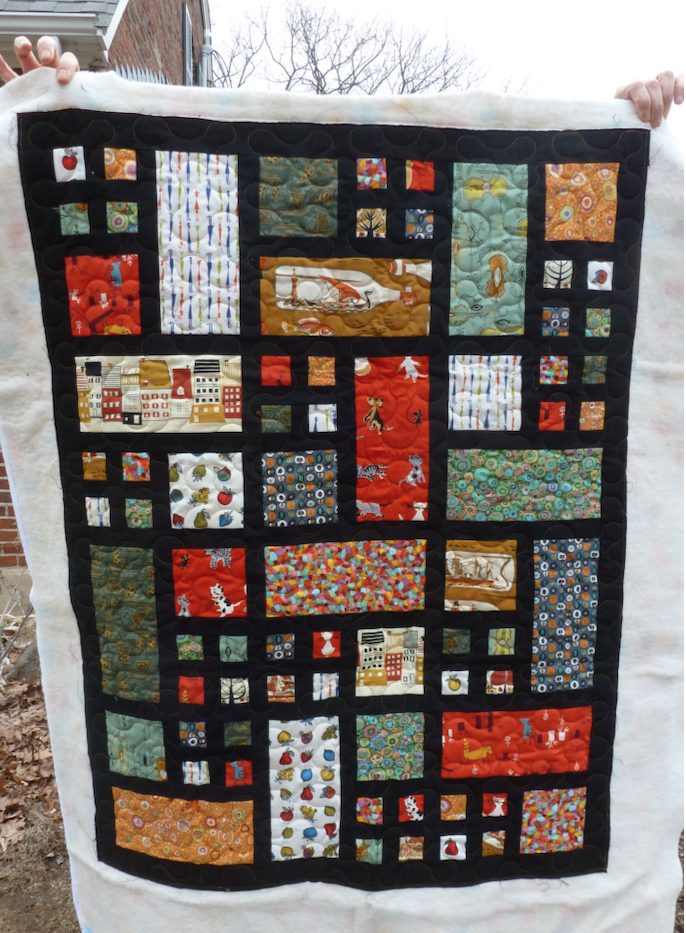
Speaking of quilts, I've finished this "Gallery of Kitties" quilt top, featuring vintage and contemporary feline prints. The design is a variation of the traditional framed one-patch. The fabric with the tomato-red background is a Michael Miller fabric company "tribute" to artist Tammis Keefe and is adapted from one of her textile designs. Cats and dogs appear on many of the items Keefe designed during her career.
 
Gallery of Kitties quilt top.

Calendar hankie, Tammis Keefe. Note cat in image under "Oct."

The image above is from my personal collection, http://www.tammiskeefe.com/Hankies/Calendar.html

It's instructive to see how different artists, working in vastly disparate circumstances, abstracted the familiar form of the housecat. An excellent book with many cat images is Sandi Fox's Cats on Quilts; Ms. Fox not only offers up appliqued, embroidered and printed cats, but snippets of cat-themed poetry and prose. (ISBN 0-8109-5725-6)
With what silent
stealthiness,
With what light steps
do they creep
towards a bird!
---Pliny the Elder (23-79 AD)
Suzuki Harunobu. Young Woman holding cat and young man holding mouse.

Pets have long been associated with comfort and domesticity, and these prints, with their sumptuously depicted textiles, record and reflect aspirational consumption - the life and leisure of those fortunate enough to have animals whose sole purpose is to amuse and entertain.

Okumura Masanobu. Courtesans Imitating the Four Sleepers.

There is a humorous element to many of the images, and Okumura's print parodies the legend of a Buddhist monk so enlightened he blithely slept alongside a tiger, joined by two young acolytes eager to imitate their elder. In Okumura's print, a young woman, her two young attendants and her tabby cat, striped like a tiger, form a tableau vivant gently mocking the legend of the monk.

Utagawa Kunisada I. Fond [sic] of Goldfish.

No, the above image doesn't have a cat, but the masterly blending of purple into yellow in her kimono was just too beautiful not to include.