28 October 2012

(1) The Postcard Age and (2) Mary Oliver

Couturier Vionnet advertising cards by Ernesto Michahelles.

When my children were young, prior to our annual trips to the Cape or further afield, I would pre-print address labels.  Each night, daughter and son would each write one postcard, to grandparents or a friend.  We're not talking Hemingway here; the messages were necessarily brief and on the order of "Dear Grandma, we saw a whale today and had spaghetti for dinner. It was good!"  Stamped and addressed, with those handy labels, off the card would go.

The recipient was thrilled and the children learned to record observations about their day in this child-friendly form of written communication.  As they progressed through school, in-class essays never held any terror for my children; the postcard practice helped them approach the blank page with less fear.

I still love to send and receive postcards, so imagine my eagerness to see a new exhibit at the MFA, The Postcard Age, drawn from the 100,000+ collection of Leonard Lauder.

Cards by Ilona Mate, circa 1906. 

We're all familiar with the static, depopulated photographs of monuments. This is not what Mr. Lauder so thoughtfully amassed. Instead, he focused on cards which captured the spirit and activity of a specific time and place. Propaganda, advertising, technology - it's all here, not to mention The New Woman, sports, and transportation.  Graphic artists created masterpieces in a format of 3.5" by 5.5" inches, working in art nouveau and other styles, proving once more that limitations - in this case size - can be liberating.

In addition,  for anyone interested in fashion this is a must-see exhibit, as you can tell from the images I sneaked for this blog.  The curatorial commentary is excellent too.

Blow-up of postcard advertising bicycle tires; note bloomers!

After looking at the exhibit I took a seat in the Remis Auditorium at the museum for a sold-out poetry reading by Mary Oliver, shown  below graciously signing books after the reading. The last image below is of her hand, writing.

Ms. Oliver signing my books.

Ink, pen and paper.
Ms. Oliver is a Pulitzer prize-winning poet now living in Provincetown, Massachusetts.

I Go Down to the Shore

I go down to the shore in the morning
and depending on the hour the waves
are rolling in or moving out,
and I say, oh, I am miserable,
what shall-
what should I do? And the sea says
in its lovely voice:
Excuse me, I have work to do.
Poem from A Thousand Mornings, by Mary Oliver, The Penguin Press, 2012, ISBN  978-1-59420-477-7.


23 October 2012

Tammis Keefe website - tablecloths added!


Collage of tablecloths by designer Tammis Keefe.

Kindly click on any image to enlarge it.

Due to an outstanding effort by my DH, tablecloths have now joined handkerchiefs and linen towels as categories on the website www.tammiskeefe.com.  Tammis Keefe (1913 - 1960) was a woman textile designer who deserves to be better known and, slowly but surely, we're creating an online catalogue raisonne of her oeuvre.

Party tablecloth.

It's exciting to find Keefe's work in contemporary books and magazines, and I was delighted to discover the Party tablecloth featured in William Pahlmann's eponymous book The Pahlmann Book of Interior Design, first published in 1955 (wikipedia date is incorrect).  Pahlmann was an influential decorator and product designer who led the interior design department at Lord & Taylor before establishing his own independent firm.  He was also responsible for the first incarnation of the Four Seasons Restaurant, in architect Philip Johnson's Manhattan masterpiece, the Seagram Building.

Party tablecloth, The Pahlmann Book of Interior Design.

Party tablecloth, detail.

Although my copy of this book is a library discard, indicating that the collections manager found the book out-dated or superseded, I find Pahlmann's advice still timely.

 Small dining spaces for informal family meals are often included in kitchens and while I hate to refer to these as the breakfast "nooks," that's what they grew out of.  See that this space is well-lighted and attractive, since you should always eat in attractive circumstances if you want to preserve your digestion. Children, especially, need light when they eat. These eating spaces usually accommodate a table and four chairs, but some people have reduced them to counters, where the family lines up.  There is always something sketchy and hurried about a counter meal and, personally, I prefer a table where there are children in the house. 
 --Pahlmann, p. 230

Amen - especially with a Keefe tablecloth on the table!

19 September 2012

Juji-tsunagi sashiko sampler

Completed sampler.

I recently completed an Olympus-brand sashiko sampler in the traditional pattern called juji-tsunagi, which literally translated means "filled with groups of ten." The Japanese character for the number ten looks very much like the Western alphabet lowercase "t".  By stitching a field of linked "t" symbols this pattern invokes prosperity - may your fortune increase tenfold.

I chose to stitch the sampler, ordered online from my wonderful supplier, Miho, in two colors, Olympus # 10, a denim blue, and Olympus #5, a mustard yellow, which is one of my favorite colors in their range. This is going to be a teaching sampler, and the two colors will clarify the exact stitching sequence, which is very straightforward anyway in this pattern.  I also just like the combination of blue, yellow and white.

Blue stitching complete, braided skein.

When I've taught sashiko before, the biggest challenge seems to be with beginning and ending a line of stitching using the backstitch approach. So the stitching in this sampler, which is a teaching demo, starts and stops with just simple knots. To end the stitching I used a "needle knot;" my recent attempts at shibori dyeing have improved my skill in this detail, which is similar to making a French knot in embroidery.

To form end knot, loop thread around needle.

Tighten loop.

Using fingernail, hold loop at fabric surface, pulling thread through.

Knot complete.

Completed sampler, right side (left) and reverse.

16 September 2012

Funny Face Productions

Lawrence of Arabia, before.

A long time ago, by approaching the manager of the now-closed AMC Harvard Square cinema and asking nicely, I acquired an actual movie poster - a re-release poster of the film Lawrence of Arabia. I don't know what this says about me as a person, but this movie, with its cast of thousands, not to mention thousands of camels, deployed in beautifully choreographed and filmed battle scenes, is one of my favorites. It's astonishing that Peter O'Toole did not win the Oscar that year, although Gregory Peck was no slouch in To Kill a Mockingbird.

I framed my poster and displayed it proudly, but, unfortunately, it was water-damaged when stored in my in-law's home (see image above).  So, the poster went into the back of a closet for years.

A closet clean-out  forced some action - either fix the poster or discard. Could this poster be saved? A little research revealed that a very well-regarded poster restorer works about an hour away from my suburban Boston home, in Haydenville, Massachusetts.

Lawrence, after having work done.

Ted  Eiseman, doing business as Funny Face Productions, worked wonders on the poster (see image above.) For less than $100, he gave the poster a linen backing and touched up the worst of the damage, so my once warped poster is now ready to re-frame. For a price, Ted is capable of completely restoring almost any damage to a poster, but he worked within my budget to meet my goals, and I am grateful for his flexibility.

Movie poster now has linen backing.

My poster is an odd size - 26 1/4" wide by 20" tall. Movie posters come in a number of standard sizes, and the nearest standard size to my poster is called a "half sheet" and measures 22" x 28". Perhaps, in my youthful ignorance,  I trimmed my poster to fit a standard art poster frame, although the original lithograph registration marks remain in the lower corners.

Ted graciously allowed me to photograph his studio and posters in various stages of restoration. 
Poster awaiting treatment.
Tools of the trade; paste and applicator, lower right.
Treatment tray.
In progress.
8-sheet Carter the Magician poster.
Restored and mounted posters.

After dropping off the poster, we drove into nearby Northampton for lunch at a Moroccan restaurant, Amanouz Cafe.  While we ate a gaggle - flock, bevy, herd? - of middle-aged, incredibly fit-looking cyclists entered the restaurant, all in matching red-and-white knit shirts, piling their helmets, saddlebags and water bottles on a table. Well, we certainly enjoyed our vegetarian couscous and hope they did too.

A unique city hall - Game of Thrones, anyone?
Sights in downtown Northampton.
Amanouz Cafe, with cyclists.

Ted didn't take long to finish work on my Lawrence poster, as well as two others, and we combined poster retrieval with a business meeting in Amherst, home to the flagship campus of the University of Amherst, as well as Amherst College.  I found Amherst delightful, with independents bookstores, and other fun places to shop, including that refuge of waiting wives everywhere, a yarn shop.

Sights of Amherst.
The Creative Needle.

The Creative Needle is located a row of stores, called the Carriage Shops, a short walk from the historic center of town and set back from the main road in a mixed-use building.  Proprietor Elaine, helpful and friendly, maintains a densely-packed Aladdin's Cave of knitting and needlepoint supplies, Of course I bought a skein of yarn for a scarf, with directions for a design Elaine developed herself.

The Blue Marble.

Another wonderful emporium is The Blue Marble, whose owner, Cathie, clearly has expertise in retail buying and display.  Her focus is gifts with a positive narrative, and Cathie presents a selection of  well-priced fair-trade and locally-made goods that are chic, sophisticated and fun.  In the image above Cathie displays a luxurious scarf of wool felted over an up-cycled sari, resulting in a meltingly lovely texture and color.

The store features a combination of items both decorative and useful, including desk accessories that one would actually use, charming tabletop pieces in wood, glass and metal, and scads of hand-knit socks in fine yarn and rich colors. I wanted to buy every pair of earrings, too, but limited myself to one gift, beautifully wrapped as I waited, for a friend.

Can't be grumpy eating here.

 On Cathie's recommendation we ate lunch at Judie's, just down the street. The upbeat decor alone was worth the price of admission, and we broke one of our rules, "Never eat anything larger than your head," as we tackled the immense, crusty pop-overs which are served with house-made apple butter.

DH with popover.


We purchased a jar of the apple butter to go, and headed back to Boston.


12 September 2012

Fresh Corn Salad


Since making textile art is hard work, we need to refuel and take care of ourselves. It's sweet corn season here in New England; here's an "off-the-cob" recipe we enjoy.

Chunks of corn kernels are main feature of the salad.
 
Fresh Corn Salad

Dressing
½ cup cider vinegar
¼ cup sugar
½ tsp salt
few grindings black pepper

Salad
4 ears fresh corn, briefly boiled
½ cup finely diced red onion
½ small cucumber, seeded and chopped
½ cup red or orange sweet pepper, finely chopped
12 cherry or pear tomatoes, halved
3 Tbsp (about 6-8 large leaves) basil, torn
3 Tbsp parsley, torn (optional)
1 Tbsp fresh jalapeno pepper, seeds and veins removed, finely diced 
     (can use canned jalapenos in a pinch)
1 to 2 cups arugula leaves, stems removed

1. For dressing, in glass or stainless bowl, mix together vinegar, sugar, salt and black pepper until sugar is dissolved. Allow dressing to stand while preparing salad.

2. For salad, cut corn kernels from cobs. In large bowl toss corn and remaining ingredients except arugula.

3. At serving, divide arugula among serving plates or bowls. Pour dressing over ingredients in large bowl, mix gently and place over arugula.

Makes 6-8 servings as a side salad. Adapted from Better Homes and Gardens magazine, July 2012

Notes on preparation:

When cooking corn to cut off the cob, break cobs in half - the halves fit better in the pot and are easier to handle when cutting off the kernels. Boil only for a few minutes.

Half cobs fit nicely in pot.

Stand half cob on end, slice off kernels with sharp knife.
After arugula is washed, I just slice off the stems - yes, it's a bit nicer to tear off stems individually, but that's time-consuming.

Trimming arugula.

Trimmed arugula awaits the topping of dressed corn mixture.

Finally, I think this salad would be almost as good with frozen corn, prepared as per package directions, and will try that this winter, when the ears of sweet corn at the farmer's market are a memory.

11 September 2012

An Ode to a Small Town - St. Peter, Minnesota


Sights in and around St. Peter.
Click on any image to enlarge it.

St. Peter, population about 10,000, is home to Lutheran-affiliated Gustavus Adolphus College, now celebrating its sesquicentennial. The town, founded in 1853, narrowly missed out on displacing St. Paul as the capital of Minnesota. The story, detailed in the St. Peter wikipedia page, involved a Henry II-like governor who asked who would rid him of this troubling legislation, a hard-drinking legislator happy to oblige, and another entry in the annals of Lost Opportunities.

Arts Center of St. Peter.

Like many college towns, St. Peter has cultural resources out of proportion to its size, including a wonderful neighborhood Arts Center. The town was ripped apart by a  F4 tornado in 1998; the cultural center was levelled. The new Arts Center is a storefront operation on the broad main street, Minnesota Avenue.  The storefront location creates some odd adjacencies - the next door neighbor is a gun shop - but there is something compelling about a walk-in arts facility cheek-by-jowl with insurance agencies, restaurants and other main street businesses. 

Van Gogh's pick-up truck, parked behind the Arts Center.

Minnesota Avenue.

I flew to St. Peter for a week-end class at the Arts  Center given by Patricia Freiert, textile artist, entitled Shibori in Circles.  (Shibori is a traditional Japanese resist-dye technique.)  On the one-hour drive from Minneapolis, Pat's husband Will, who kindly retrieved me from the airport, made an excellent tour guide and St. Peter booster.  He chatted up the local fare, about which I remained skeptical until lunch and dinner made me a convert.

I'm not smart enough to work at my art and talk at the same time, so the workshop lunch break was a welcome opportunity to chat over delicious salads, soups and sandwiches at the River Rock Cafe, and learn more about my five talented classmates, Robin, Cheryl, Linda, Barry and Edi.  Sadly, my appetite just couldn't manage a famed River Rock ice cream sandwich.

Gourmet satisfaction achieved.

Later on my own I explored the St. Peter Food Co-Op, a better version of a Whole Foods store. Native American culture was in evidence in the offerings on the shelves - Sumac jelly, for example, made by Native Harvest. Though it meant checking my bag, purchases were inevitable.

Colors of St. Peter. Bottom left is wall of warm Minnesota stone.

On the last day of my stay my hosts Pat and Will and their red Prius took me to two more St. Peter sights. Stop one was the First Lutheran church, where I particularly admired Pat's contribution to the worship space.  Her shibori banners celebrate the liturgical year and ameliorate what might otherwise be a rather severe brick-faced interior. 

Shibori banners by Patricia Freiert.
First Lutheran altar, with banner by Pat Freiert.
 The colors of the banners tie the clerestory stained glass to the kneeling pads at the altar.  I'm not sure of the imagery behind the altar, but Pat's banner to the right clearly evokes the Minnesota river, as well as regular rows of crops, and monarch butterflies, emblematic of the days of summer which arrive following the Christian holiday of Pentecost, a "moveable feast" celebrated in late May or early June.

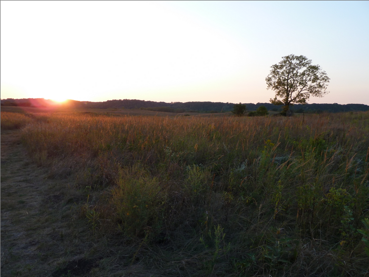
Back into the red Prius for a country drive to the Kasota Prairie, a ninety-or-so acre parcel of virgin prairie land in the Minnesota River valley.

Left, soybeans. Right, prairie.

Flying geese and moonrise over the prairie.

After watching the sun set over the prairie, we returned to St. Peter, the Prius dusty from the dirt roads.  I flew back to Boston with a renewed appreciation for the joy of unexpected discoveries, whether prairie or small town. Thank you, Pat and Will.

Sunset at Kasota Prairie reserve.


04 September 2012

Sturbridge Vintage Fashion and Textile Show

Time travel through fashion.
Labor Day, September 3, 2012, found me driving west on the Massachusetts Turnpike, I-90, to the Host Hotel in Sturbridge. Although the vast Brimfield Antique show is well known, the kick-off event is actually the Sturbridge Vintage Fashion and Textile Show, held thrice-yearly in the ballrooms and conference areas of the hotel, on the Monday of Brimfield Week.

I hadn't been to the show in a while, and noted changes in the offerings - much more menswear, for example, including lumberjack flannel shirts, wingtip Gatsby shoes, sturdy military and work uniforms, and varsity letter sweaters from the "Leave it to Beaver" era.  Less interesting to me was the explosion in the volume of costume jewelry on offer, much of it cheap-looking when it was new, and not improved by age. Still, there were plenty of antique toiles, bolts of vintage ticking, wonderful quilts, feedsacks, cashmere and beaded sweaters, and buttons galore.

Not just western items - textiles from Tibet, Nepal and Bhutan.
Designers come for inspiration, but it is a little too easy these days to take a cell phone photo of, say, a vintage blouse, and send the image to a factory in China.  Abuse of the show's resources has led to a policy of no photography without the permission of the dealer. The images in this blog are from dealers Judy Jungen, Melody Fortier, and Tom Arsenault, who gave kind permission for my photography.

Fashion plates, white dresses, fun buttons.
Click on any image to enlarge it.