31 August 2021

Newton OutDoors - upcycling old doors


Creating in Nature, Howie Green, detail.

Our city has a Community Pride organization which supports arts and culture activities throughout the town.  There's more art than ever outside this year, in part due to the pandemic.  Through a juried process 25 artists - including several high school students - were selected to repurpose old doors as public art. There are several locations throughout town; I visited all of them in a sort of  "Tour de Doors".  All of the panels are thoughtful and thought-provoking; below are images of some of the doors which particularly spoke to me.

Let Me In, Grey and Leslie Held.

Let Me In, verso.

Inside and Outside of the Virus, Sophy Tuttle.

The doors were installed on park land, including in my neighborhood. A historic wooden mill building, recently restored, is the back drop for a door imagining a Fig Newton festival. The cookie was named after our city and  it would delightful to have a real Fig Newton festival!

Fig Newton Festival Poster, Harun Zankel.

Doors and gates are powerful symbols of travel between worlds, or to new iterations of self; they can lead to adventure and danger or refuge -  think of the doors of a magical wardrobe,  the doors  Alice opens in Wonderland, or the doors concealing the lady and the tiger.  Can you think of other literary doors or openings?

A newcomer to Newton made her door a memory of her special place in the image below.

Mi Isla De Encanta, Yenny Hdz.

One door had to be moved from its location after vandalism, sadly. Our city is not immune to anti-Asian American sentiment and after the door below was defaced it was moved to City Hall for better monitoring.  The door presents a moving portrait of the artists' grandmother, called Por Por in Cantonese, who raised six children in nearby Brookline after immigrating from China.

Por Por, Amanda Beard Garcia, now in front of City Hall.
 
Another  portrait door co-exists among the blooms of a city-sponsored demonstration garden, another Community Pride project.

Garin and Nyle, Scott Debus.

Cheery fruits, flowers and birds figure on several doors, exploding with intense color, below.


Blooming, Julia Smithing.

Discovering Paradise, Grace Julian-Murthy.

Colorful Crows, Sepi Golestani.

A more restrained palette can be eye-catching too, and the door below, in white and blue tones, was one of my favorites. If you look closely you can see, in white outline, a pattern which looks like the leaves of a locust tree. This is an homage to an ancient locust tree, long a sentinel at our local historical museum, which sadly toppled during a storm in 2020.  Look also for the occasional bird silhouette.


Welcoming Committee, Kit Collins.


Welcoming Committee, detail, with locust leaves pattern.
 
Two of the most striking doors were made by students from our two high schools.

Corner Vending Machine, Abby Zheng (high school).

Ms. Zheng's comments, from the Community Pride website:

There were multiple vending machines scattered throughout my school, and I would catch a reflection of myself as I walked by them every morning just as the bell signals the beginning of the school day. These vending machines would attract a group of friends during lunch who are in search of a snack. I came to associate vending machines as something that brought strangers and classmates together. It became these sockets of shared moments where quarters would be given to the person who doesn’t have enough change. It was a place where friendly conversations would occur. I have walked by these vending machines so often that I can almost hear the conversation: “What chips should I get?” “I hope the chocolate bar doesn’t get stuck” or “Here, you can have this bar—two fell down”. I wanted to recreate these moments of interaction. I want my audience to have their eyes scan over the wide variety of snacks that the vending machine offers, standing there for 5 seconds, 10 seconds, or even a minute. In that brief moment of time, I hope strangers or acquaintances will approach each other and create a bond, even if it’s over a door. For me, the vending machine is a door to new friendships and relationships.
I assume she added cats as kitties are everywhere now, yes? I hope to more of the work of these two talented young people in the future.

 
Gaea, Chengyue (Sara) Wang (high school).


Gaea, detail.

27 August 2021

Lucienne Day kitchen towel designs


Black Leaf.
 
 
In my textile travels, I have had the joy and privilege of connecting with other like-minded folks, including Denver-based modern design aficionados Jill Wiltse and her husband, H. Kirk Brown III.  Brown and Wiltse shared items from their collection of textiles to create the 2010 exhibit Art by the Yard: Women Design Midcentury Britain at the Textile Museum in Washington D.C.  Fabric designs by Lucienne Day were featured in this exhibit, and Wiltse and Brown also made a documentary, Contemporary Days, about Day and her husband, industrial and furniture designer Robin Day. This excellent film is just one of a series celebrating modern architecture and design.
 
The documentary is well-researched and just delightful - luckily there is a lot of extant contemporary footage of both Robin and Lucienne.  Their daughter Paula has obviously been a good steward of their legacy, in addition to establishing her own career as a garden designer.

Bouquet Garni.
 
Viewing the DVD prompted me to dig out my Lucienne Day kitchen towels.   Day designed a number of towels in the late 1950's and early 1960's, and states in the film that she enjoyed this work, as when developing a towel motif she didn't have to worry about the "repeat". "Repeat" refers to taking a single motif and deploying it into a "repeated" continuous field on yardage.  Today this can be accomplished digitally, but it used to be a time-consuming process.  

Too Many Cooks, lime colorway.
 
The towel designs have the same wonderful sketchy graphic quality of many of Day's furnishing fabrics, as well as her distinctive use of color.  Several of the designs were produced in multiple colorways on Irish linen.
 
Too Many Cooks, purple colorway.


Too Many Cooks, red colorway.


Too Many Cooks, detail.

Both Robin and Lucienne were recognized in their lifetimes with awards and commercial success.  At least two of Lucienne's towel designs were celebrated by the British Design Centre.

Provencal.


Provencal, original stickers.

Day produced at least nine designs for towels and several have been reproduced, under license, by a British company, twentytwentyone.
 

Good Food, red colorway.


Good Food, detail.


Good Food, teal colorway.


Good Food, detail.


While Day's furnishing fabrics can be expensive on such sites as ebay, the towels provide a more affordable opportunity to own and enjoy work by a celebrated woman artist.


Jack Sprat.

15 August 2021

Raining rainbows embroidery

Raining Rainbows design, simplified.

Time for some easy stitching. I found this free, downloadable embroidery pattern at:

I simplified the design a bit and followed the artist's suggestion to use a product called Sticky Fabri-Solvy to transfer my modified pattern to my fabric.

Simplified design on trace paper.

 
Using the single sheet feed on my photocopier, I fed in one sheet of the Fabri-Solvy and photocopied my trace paper design. Then I followed the directions on the Fabri-Solvy package - peeled off the backing sheet and stuck the design right down on my blue Essex cloth.  Essex cloth is a linen-cotton blend with a fairly open weave, so it's good for embroidery.  The layer of Fabric-Solvy did make my embroidery needle stick a bit but, for a simple running stitch, sewing through the adhesive sheet and fabric substrate was fine.
 
Light blue Essex cloth and pack of Fabri-Solvy sheets.


Fabri-Solvy, with design, adhered to cloth and in hoop.

I initially stitched the cloud outline in white, but decided that would be too low contrast with the blue fabric, so I removed that stitching and resewed with black. Much better. All the stitching done with two plies of DMC embroidery floss, by the way.

Hard to see white thread on light blue.


Cloud restitched with black, red rays stitched.


Continuous stitching started at the eyes, then the mouth and finally the outline.

All the rays stitched, but yellow and green colors too wimpy.

I also swapped my original yellow and green threads for richer colors. Once the stitching was complete, I trimmed the excess Fabri-Solvy from the design, following the package instructions.

New green and yellow colors, now finished.


Trimmed and ready to dunk in water.

Fabri-Solvy flaking off in water.
 
When immersed in warm water (no soap) the adhesive does flake off and dissolve, and I detected no tackiness after the project air-dried. Don't know if I'd use the Fabri-Solvy for something intended as an heirloom, but certainly a convenient way to transfer patterns.  Not sure yet what I will do with my Rainbows - but may simply frame it in a hoop, for display. Stay tuned.

09 August 2021

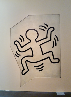
Keith Haring: Grace House Mural in Denver


Radiant Baby motif.

Late last month DH and I got on a plane for the first time in a year and a half. Masked from the time we stepped into our Uber in Boston until we left the Denver terminal, we flew to Colorado to visit family and took in this exhibit. 

In the early 1980's artist Keith Haring painted designs on a stairwell at Grace House, a Catholic-run youth center in Manhattan.  In 2016, the church which operated the center decided to sell the building and removed thirteen images, no easy feat as these black-and-white line drawings were painted on concrete block walls. Removing valuable artwork from walls is not without precedent, but in this case it was the institution's decision.  After removal, the segments were sold at auction and purchased by an anonymous buyer. The fragments are on display at the Museum of Contemporary Art Denver, through August 22.


Exhibit includes original stairwell utilities.


The images are slightly larger-than-life.


Haring painted these images right around existing doors, a mailbox, and other stairwell elements, some of which are included with the fragments.


Haring responded to elements of the stairwell. 


Fire extinguisher sign from original stairwell.

From the exhibit wall text:

After experimenting with collage and automatic drawing, Keith Haring (b. Kutztown, PA, 1958, d. 1990) developed a direct and unmediated approach to artmaking, which Grace House Mural vividly reflects.  This project makes clear how the strength of his work lied in his bold and flexible use of line. A fluid, confident, and jubilant application of paint on the wall pulsates with energy and vitality.  Haring's graphic style is expansive, extending beyond a frame and stretching into our space; it is meant to be in conversation with its viewer.

Grace House Mural was designed specifically to inspire and elevated the spirits of some of New York's teens and includes some of his most iconic motifs: the "Radiant Baby," "Barking Dog," and dancing figures.


Barking Dog motif.


Dancing figure.


At the base of some of my images you can see what look like metal tabs sticking out at the floor level. If I understand the wall text, and brief comments from a gallery attendant, correctly, the concrete blocks were sliced so as to retain only part of the face of the block. These wall slices were then mounted on some kind of metal framework, which stands on brackets visible at the base of the walls of the exhibit. It would have been fun if one fragment had been free-standing, or otherwise displayed in such a way as to demonstrate these conservation efforts.

Somewhere in transit between New York and Denver some cracks appeared, sadly. This is most easily seen in the image below.  This must have been very challenging conservation project.


A few fragments developed cracks.

However, at least the mural survived, even if removed from its narrative flow. Very few of Haring's murals are extant.

Below, more dancing figures. They just vibrate with motion and joy.


Exterior, Museum of Contemporary Art, Denver.

The MCA Denver doesn't have a permanent collection but does feature a rooftop cafe with fun views of downtown Denver, and a small but well-curated gift shop.